
Designer Tips for Using Colour in Your Space
Adding colour to your home can feel intimidating—but it doesn’t have to be. When done with intention, colour has the power to energize, uplift, and define a space. Whether you're craving a bold transformation or just looking to inject more personality into your home, the right colour strategy can make all the difference.
In a recent Instagram reel, I shared four practical designer tips to help you use colour with confidence, featuring two stunning projects:
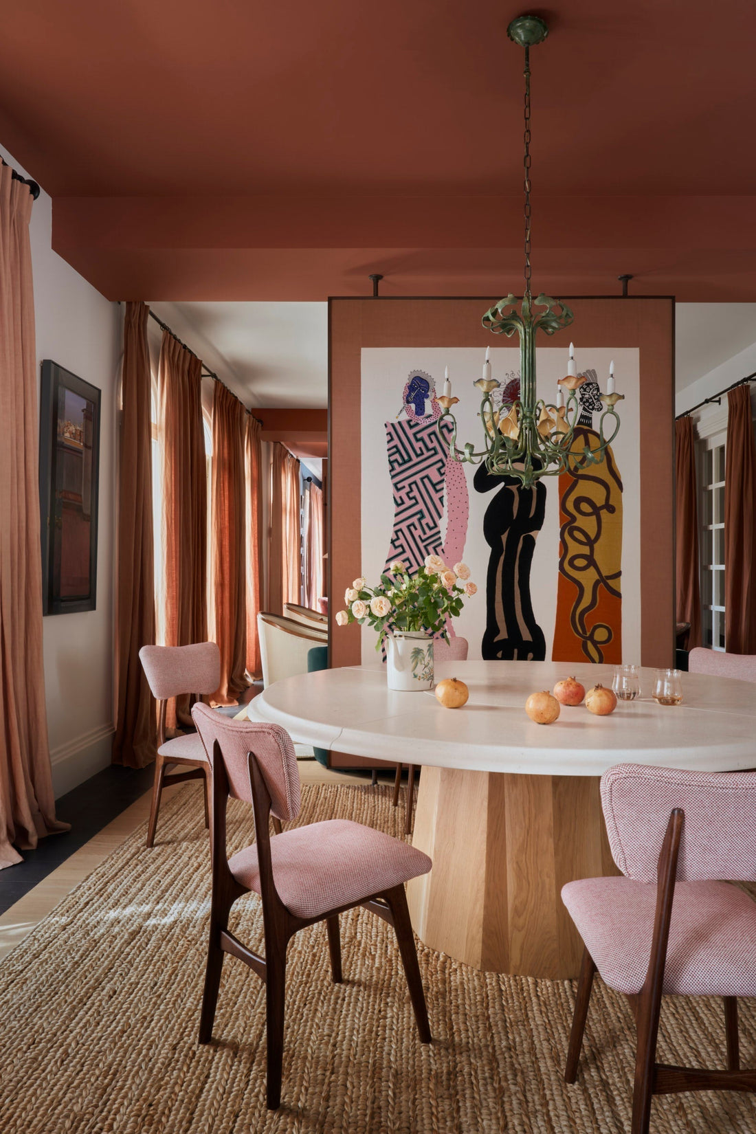
Marta de la Rica's Terracotta Wind project in Madrid via Desire to Inspire
Maddux Creative Clerkenwell Penthouse in London via The Design Files
These spaces are perfect examples of how colour can be bold, balanced, and beautifully curated. Let’s take a closer look at the tips.

1. Let Art Guide Your Palette
Start with a piece of art you absolutely love. Whether it’s a vibrant painting, a print from your travels, something you created yourself or a print from our shop, pull two to three colours from the artwork to build your palette. This approach creates instant cohesion and brings personal meaning to your design.
Don’t forget to actually hang the art! It shouldn't live on your Pinterest board forever—let it breathe life into your home.

2. Repeat Key Colours
Once you've chosen your colours, don’t just use them once—repeat them intentionally throughout the space. This repetition creates rhythm and harmony. For example, if you’re using pinks, it might show up in different shades in your chair cushions, a curtains, or even a patterned rug.
Balance is key. While repetition creates unity, introducing multiple complementary tones keeps the space dynamic and visually rich.

3. Choose a Bold Piece
Sometimes, all it takes is one statement item to shift the entire energy of a room. This could be a bold sofa, an eye-catching armchair, or a striking area rug in a colour that speaks to you.
This “anchor piece” becomes the heart of your palette, setting the mood and guiding other design decisions. Be fearless—your bold choice can still feel timeless if balanced correctly.

4. Ground With Neutrals
Bold colours pop best when grounded by neutral tones. Think sandy beige, warm white, soft grey, or earthy taupe. These tones act as a visual breather and help the eye relax while still allowing colourful elements to shine.
Want a bit more interest? Play with patterned neutrals—a neutral wallpaper with subtle texture or a tone-on-tone patterned rug can add depth without stealing the spotlight.
Whether you're styling an office or refreshing your family room, using colour doesn’t require a complete overhaul—it requires intention. These four strategies can help you use colour thoughtfully, express your personality and create a space that feels uniquely you.
Which of these tips are you excited to try first?
Have a favourite way to use colour in your space already? I’d love to hear your thoughts in the comments!
✨ If you're ready to take the guesswork out of decorating, let’s bring your vision to life! Book your design consultation today and get started on a space that reflects who you are and how you want to live.
And don’t forget to follow @studiomonijah for more design inspiration, tips and behind-the-scenes peeks into my process.